Hi!
Comparison post day today :) This is Joe Fresh Fluo Blue VS Essence Let's Get Lost! Both are gorgeous vibrant blues leaning towards the aqua/turquoise end of the blue spectrum.
I'll let you guess which is which!
Index & Middle: Essence Lets Get Lost
Middle & Pinky: Joe Fresh Fluo Blue
Verdict: Not Dupes. Essence is just SLIGHTLY darker and just SLIGHTLY muted compared to the Joe Fresh. However when worn on its own it still appears bright and vibrant. Both formulas are awesome and its possible to get away with just one coat of both! Joe Fresh retails for 3/10 dollars and the Essence for 1.50.. Both bottles are on the smaller side with the Joe Fresh being a little bit bigger than the Essence.
I don't think you need both but you definitely need at least one! This colour is awesome and the great formula and price makes it EXTRA awesome :)
Showing posts with label Comparison. Show all posts
Tuesday, 4 September 2012
Tuesday, 7 August 2012
OPI Texas Sorbets Comparison Post!
Greetings fellow polish lovers!
Today I am featuring a couple of the OPI sorbets from the Texas Collection from last year. I know I am a little late to the party, sorry about that! I didn't buy these when they came out and I regret it! I just came across some of them at a salon and had to snatch them up to try.
First of all...OPI says these shades have a "sorbet" finish.. but lets be serious here OPI.. they are regular jellies. Don't get me wrong, jellies are like in my top 3 favourite finishes!! Lets just call them what they are though, okay OPI? Great. Haha!
Second of all.. these shades are ALL really similar shades of pink. What is up with that? Why not switch it up a bit? I would LOVE to have some jellies that aren't different variations of pink.
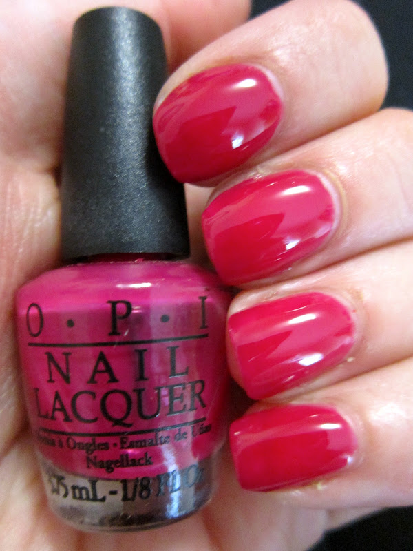
First up is Do You Think I'm Texy?
Out of the colours I found, this shade looks the most pink to me, leaning to the purple end of the pink spectrum. Almost a raspberry shade of pink! This is three coats for full opacity. Sadly I could only find this one in a mini bottle :(
Second up to bat is Too Hot Pink To Hold 'Em. Looks very very pink in the bottle but on me it pulls more of a coral/maraschino/cherry tomato colour after the three coats that were needed for no VNL. Still just a different shade of pink though I guess.
The last shade I found is Guy Meets Galveston. This is another shade of pink.. but learing more to the orange side of coral. This was the sheerest for me, and I needed four coats for no VNL although it did look fine at three.
Finally, here is a comparison of the three colours since they seemed SO similar I felt the need to look at them right next to each other.
Middle: Too Hot Pink To Hold 'Em
Ring: Do You Think I'm Texy?
Pinky: Guy Meets Galveston
When they are right beside each other you can definitely see the difference between the colours but I am still sort of sad that OPI didn't spice it up a bit. Also I am a bit sad that my favourite of the three is Do You Think I'm Texy and sadly I only have a mini bottle of it :( With three coats needed I am going to plow through that bottle pretty quickly!!
On the other hand though, the formulas were quite good! Not streaky and they dried quickly to an awesome squishy/glossy finish that I love from jellies!
Hopefully I can find the others in salons too, and maybe even a full sized bottle of Do You Think I'm Texy! I was also really impressed with the quality of the OPI NYC Ballet Jellies.... so please OPI... hear my prayer.. MAKE MORE JELLIES! MAKE THEM IN UNIQUE COLOURS! *does the polish prayer dance*
So long for now!
Saturday, 21 July 2012
OPI Lincoln Park After Dark, Original & Suede - Swatches & Comparison post!
Hello! My countdown is on! ONE WEEK LEFT OF WORK! Flight is booked for the 28th! Anyway, on to the polish..
I thought my dreams of trying an OPI suede polish had died long ago, I could never find them ANYWHERE. But luck has it my local Winners got some in and even though I was on a strict no buy at the time... I picked this one up. Lincoln Park After Dark is one of the OPI core colours and I love it to pieces so I knew I would like the suede version.
Here is the original. Nice blackened vampy plum purple. It is especially awesome on short nails. Two coats, no topcoat. It applies like a jelly-creme hybrid (love that), and is very shiny on its own.
And here is the suede version. I don't know what the difference between the OPI Mattes and Suedes are.. they both look matte to me. *[EDIT: Figured it out, OPI Suedes have that hidden shimmer, their mattes don't!] Anyway Lincoln Park After Dark, the suede version, is much lighter than the original. Not blackened at all. To me it looks like a plum purple, leaning a little mauve with a silver shimmer that really comes out to play when you add topcoat. I love the look of this. It is just one coat :) Application was relatively easy for a matte. It was fast drying but not so fast that it ruined application or anything :) When you add topcoat, the mauve undertones completely disappear and it gets a few shades darker and more intense. The shimmer is all microglitter-y and awesome. Sorry I dont have a picture for you of that :(
& Here is the inside of little tag that came on the polish. It gives fair warning to the consumer that it doesn't wear well (like pretty much all matte polishes). I did notice that after washing my hands, & applying hand cream a little later in the day that the completely matte flat look of the polish had faded slightly, so OPI was not lying about that either.
Guess what else they weren't lying about? Wear time. I added some glossy tips, and this picture was taken after exactly 24 hours of wear. Would you look at that? I have never had a polish chip randomly in the middle of my nail. Weird. Sorry for the horrid photo. I was busy, but wanted to grab a picture of what the polish looked like at the 24 hour mark. You can also tell the matte finish has faded in the picture, like they mentioned in the tag.
For the cool matte look though and the price I got it for at Winners, ($7).. I think it is worth it. I knew it wasn't going to wear well and I still bought it anyway because I think matte polishes are pretty cool and I don't really have that many in my collection! Does look way different than the original Lincoln Park After Dark though!
Anyway, have a great day :)
Wednesday, 18 July 2012
OPI Not Like the Movies vs Essence Where is the Party? - Purple/Green Duochrome Comparison!
Hello polish people!
Today I have got a comparison for you! There are a couple of green/purple duochromes out there in polish world but today I am comparing the two that I own :P This is OPI Not Like the Movies (From the Katy Perry collection) and Essence Where is the party? I love the name of the Essence polish. In the town where I grew up it was customary on a Friday or Saturday night to say "wheres the party at, biiiiiiii" (Don't worry, I never said it... just heard it very often hehehe).
Anyway! Heres the pictures and I'll let you see if you can guess. I'll point out some stuff at the end of the post. The first two pictures are in the shade, and the last two pictures are in the sunshine.
OPI Not Like The Movies is on my index and ring finger. Essence Where is the party? is on my middle and pinky!
Differences: They are both green/purple duochromes but they are quite different on the nail. In the pictures in the shade you can see that both have quite a strong duochrome, with the green in Essence leaning more olive, and the green in the OPI learning more gun-metal. In the sun, they look quite different. The purple of the Essence is more jewel toned while the OPI is more greyed out. The overall finish of the Essence polish is a very fine shimmer, while the OPI has a fine shimmer as well as some very small glitters/chunky shimmer thrown into the mix. It adds lots of sparkle in the sun.
Application/Formula: The OPI was thin/watery and somewhat sheer. It needed three coats for opacity. Essence only needed two coats. Careful application was needed with both to avoid major brushstrokes as the fine shimmer made the polish seem somewhat frosty if you were not careful. These pictures were taken without topcoat so it is visable here. I did eventually add some topcoat, and it fixed most of the major brushstroke issues for me.
Price/Availability: I bought this OPI at a Regis Salon for 10 dollars earlier this year, but it is a discontinued polish. It is a full sized at .5oz/15ml. The Essence is available now in Canada at Shoppers Drug Mart as a part of the core "color & go" polish line for $1.49 for .16oz. A great deal for a smaller almost mini bottle.
I will let you decide which one you need :)
Have a nice day!
Today I have got a comparison for you! There are a couple of green/purple duochromes out there in polish world but today I am comparing the two that I own :P This is OPI Not Like the Movies (From the Katy Perry collection) and Essence Where is the party? I love the name of the Essence polish. In the town where I grew up it was customary on a Friday or Saturday night to say "wheres the party at, biiiiiiii" (Don't worry, I never said it... just heard it very often hehehe).
Anyway! Heres the pictures and I'll let you see if you can guess. I'll point out some stuff at the end of the post. The first two pictures are in the shade, and the last two pictures are in the sunshine.
OPI Not Like The Movies is on my index and ring finger. Essence Where is the party? is on my middle and pinky!
Differences: They are both green/purple duochromes but they are quite different on the nail. In the pictures in the shade you can see that both have quite a strong duochrome, with the green in Essence leaning more olive, and the green in the OPI learning more gun-metal. In the sun, they look quite different. The purple of the Essence is more jewel toned while the OPI is more greyed out. The overall finish of the Essence polish is a very fine shimmer, while the OPI has a fine shimmer as well as some very small glitters/chunky shimmer thrown into the mix. It adds lots of sparkle in the sun.
Application/Formula: The OPI was thin/watery and somewhat sheer. It needed three coats for opacity. Essence only needed two coats. Careful application was needed with both to avoid major brushstrokes as the fine shimmer made the polish seem somewhat frosty if you were not careful. These pictures were taken without topcoat so it is visable here. I did eventually add some topcoat, and it fixed most of the major brushstroke issues for me.
Price/Availability: I bought this OPI at a Regis Salon for 10 dollars earlier this year, but it is a discontinued polish. It is a full sized at .5oz/15ml. The Essence is available now in Canada at Shoppers Drug Mart as a part of the core "color & go" polish line for $1.49 for .16oz. A great deal for a smaller almost mini bottle.
I will let you decide which one you need :)
Have a nice day!
Saturday, 30 June 2012
Neon Yellow Comparison Post!
This summer is all about neons.. and I love it. I can't wear them at work but I was rockin' em back home, and when I get out of the woods... trust me I will be rocking them some more. I can't get enough. Since neon yellows are all the rage right now, I combed through my neon yellow collection and picked four to compare!
From left to right we have:
American Apparel Neon Yellow
Orly Glowstick
China Glaze Sunkissed
Color Club Almost Famous.
From left to right on the nail:
Color Club Almost Famous (pinky)
China Glaze Sunkissed (ring)
Orly Glowstick (middle)
American Apparel Neon Yellow (index)
| Sorry for this horrid picture. I was rushing :( |
Colours: No dupes here. Even in the bottles, Almost Famous is the odd duckling here. It came out a couple of years ago so its not as "with the season" as the other neon yellows we are seeing this summer. Its more of a "banana" shade but don't underestimate it. It is still very bright. And it is still awesome. China Glaze Sunkissed is more of a neon lemon yellow. What sets it apart is the amazing golden yellow shimmer running through it. Stunner. Orly Glowstick.. a fantastic neon yellow that leans green. Looks exactly like the colour of a neon glowstick. Epic colour. American Apparel Neon Yellow is the standard neon yellow. It is the exact colour of a neon yellow highlighter. No muss, no fuss, no coconuts. So colour wise, they are all similar, but a little different in the details.. with Almost Famous sort of sticking out there like a sore thumb.
Formula and Application: Almost Famous has a standard Color Club two coat formula. My bottle is very old and has lost some of its self levelling ability but with some thinner I think it should be back in tip top shape soon. No need for white undies. China Glaze Sunkissed pops a LITTLE bit more with white undies but is definitely not needed. Its a thick formula. Need to watch for dragging. But two coats is enough. Orly glowstick needed three coats on its own, or two over white. Not too thin, not too goopy. Pretty good actually. And now for the problem child of the group... AA neon yellow. What a frustrating polish. Its thick & goopy AND sheer???? It needs about five coats on its own to get it smooth and opaque. Two to three over white is OKAY but probably not even. It also takes forever to dry. I practically poured half of my bottle of thinner into it. My bottles pretty old but from what I can remember it has always been a unique kind of hell to apply. I hold a special place in my heart for it though because it was my first neon yellow nail polish from quite a few summers ago and it is straight up original neon highlighter yellow. Does anyone know if I just got a bad bottle? I'll gladly pick up a different one if thats the case because I do love the colour.
Anyway, back to work! Hope someone found this somewhat helpful :]
Wednesday, 27 June 2012
China Glaze Sunworshiper VS Essie Action - Comparison Post!
Greetings!
Today I might rant a little and I apologize for that. Today is also a comparison post day!
I was at Lawtons Drugs and saw a bunch of Essies on display so I picked up Action. I hadn't seen swatches of it yet but I was really curious because it looked like a bright coloured cantaloupe that I have been looking for! You know when you imagine a shade in your head and decide you need to own it? Well that is me and the colour of cantaloupe. Well I got action home and tried it out. Originally I was excited because it seemed to be drying to a satin finish on the first coat and I realized this shade was from their summer neon collection. I was like "A JUICY NEON CANTALOUPE! COOL!" But I soon came to be VERY disappointed.
It was drying MUCH darker than bottle colour. Like, beyond what you'd expect. No, this shade is not actually cantaloupe on the nail at all. Its much darker. Not so dark as to be a traffic cone neon orange, it is more of an awkward orange. Also, for me the formula was no bueno. It was sort of goopy.. but managed to be thin enough to fall off the upper end of the brush while I was painting. It was sort of streaky. I needed four coats to get rid of visible nail line. I needed THREE over white to make everything even. I was unhappy. I liked how it was neon though. I thought it might compare to China Glaze Sun Worshiper, another yellow toned neon orange.
![]() |
| Bottle Shot of Action. I would have suffered through the formula if it ACTUALLY looked like this colour on the nail. |
These pictures are:
Index and Ring: four coats Essie Action
Middle and Pinky: three coats China Glaze Sun Worshiper
All have topcoat.
Okay, so Action is nice in its own way. It does have a nice "Squishy" look to it. I will probably wear it again because of that. If you are willing to put up with the formula, and want a neon orange that isn't traffic cone or too yellow.. go for it. I am the type of girl who usually puts up with a bad formula if the colour is a good trade off (Hi, Sun Worshiper). I think most of my disappointment stems from the fact that it is NOT bottle colour. ITS WAY DARKER. I was expecting my dream cantaloupe colour to have finally found me but I guess I have to keep looking.
Anyone know of any nail colours that are the colour of a ripe cantaloupe? Anyone else have problems with the formula/colour of Action? Did I get a bad bottle?
Tuesday, 26 June 2012
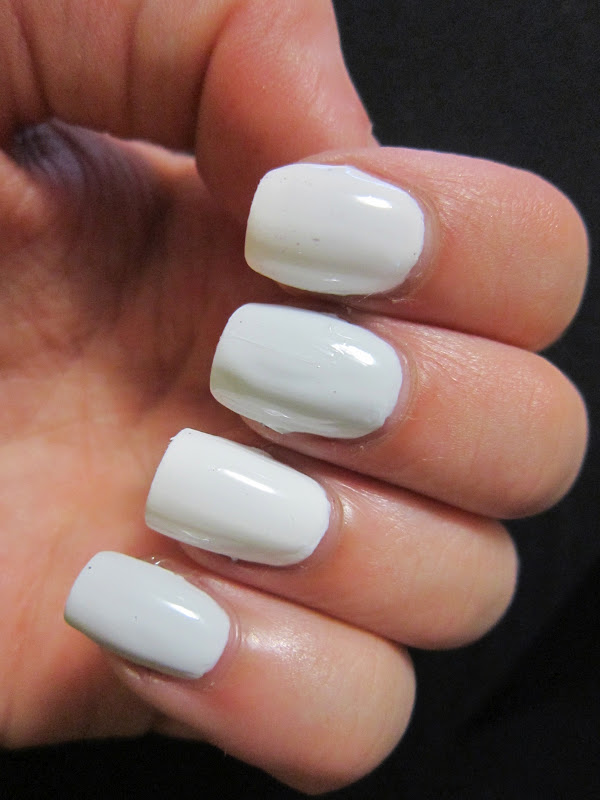
OPI Alpine Snow VS OPI My Boyfriend Scales Walls - White Comparison Post!
Today is a comparison that I was super curious about. OPI Alpine Snow (their core colour white polish) up against the newly released My Boyfriend Scales Walls (Spiderman Collection).
Application: Equal. Slightly streaky on the first coat, both even and smooth by the last. Both dry relatively fast and glossy.
Coverage wise: Two thick coats OR three thin coats will give you full opacity for both of these polishes.
Colour: OPI Alpine snow is your standard bright white. I wouldn't call it chalky but it is definitely a pure white polish. On my skin it looks slightly stark. Not like I painted my hands with white-out or anything, its just noticeably brighter. My Boyfriend Scales Walls does have some slight grey undertones taking it out of the "stark" area and making it a little more flattering on my skin tone.
Index and Ring: Alpine Snow
Middle and Pinky: My Boyfriend Scales Walls
Verdict: They're not the same, but they are very similar. I imagine the differences may not be distinguishable on all skin tones, but it is on mine. I like them both though. Alpine Snow makes a great "eye-catching" white polish, and functions excellent as an underwear polish for neons. My Boyfriend Scales Walls will make a wonderful "wearable" white for me! I will let you decide if you need both!
Thanks for stopping by! I hope this was helpful!
Thursday, 17 May 2012
NARS Kutki - Re Swatch & Comparison Post!
Hello!
Finally a sunny day outside today and I knew that I had to give more love to NARS Kutki since my pictures last post did not do it justice at all. I also thought I would compare it to some of the other light blues in my stash.
This is three coats, even though two is usually enough for me (completely user error, oops) of just Kutki in the sun :)
This re-swatch shows how vibrant it is much better :) I've been wearing this colour a lot since I bought it. I still love the colour. However I did find a flaw with all my usage lately... the cap. Its square, looks beautiful, stores nicely, but it is very awkward to paint with. I wish it was like the Dior bottles that still look adorable but pop off and reveal a user friendly brush handle.
Pretty right? And here is the comparison.. and I think it shows why I needed this polish, even for 18 dollars. This is indoors unfortunately so say hello to my red lobster hands!
Pinky: 2 coats of Joe Fresh Wave
Ring: 3 coats of NARS Kutki
Middle: 2 coats of Sally Hansen InstaDri Blue Away
Index: 3 coats of China Glaze Kinect Candy.
So, I don't have any dupes. Joe Fresh Wave is considerably more pastel, while China Glaze Kinect Candy seems a touch more green and muted than NARS. Sally Hansen Blue Away comes close hue-wise but isn't nearly as vibrant. It also has a much worse formula (and a wonky thick brush). Keep in mind NARS is about 12 dollars more expensive than the SH though.
Anyway... to my eyes.. I needed Kutki. I have been imagining this colour in my head for awhile and I think it was worth the money!
Finally a sunny day outside today and I knew that I had to give more love to NARS Kutki since my pictures last post did not do it justice at all. I also thought I would compare it to some of the other light blues in my stash.
This is three coats, even though two is usually enough for me (completely user error, oops) of just Kutki in the sun :)
This re-swatch shows how vibrant it is much better :) I've been wearing this colour a lot since I bought it. I still love the colour. However I did find a flaw with all my usage lately... the cap. Its square, looks beautiful, stores nicely, but it is very awkward to paint with. I wish it was like the Dior bottles that still look adorable but pop off and reveal a user friendly brush handle.
Pretty right? And here is the comparison.. and I think it shows why I needed this polish, even for 18 dollars. This is indoors unfortunately so say hello to my red lobster hands!
Pinky: 2 coats of Joe Fresh Wave
Ring: 3 coats of NARS Kutki
Middle: 2 coats of Sally Hansen InstaDri Blue Away
Index: 3 coats of China Glaze Kinect Candy.
So, I don't have any dupes. Joe Fresh Wave is considerably more pastel, while China Glaze Kinect Candy seems a touch more green and muted than NARS. Sally Hansen Blue Away comes close hue-wise but isn't nearly as vibrant. It also has a much worse formula (and a wonky thick brush). Keep in mind NARS is about 12 dollars more expensive than the SH though.
Anyway... to my eyes.. I needed Kutki. I have been imagining this colour in my head for awhile and I think it was worth the money!
Comparison Post! Lynnderella Connect the Dots VS Cover Band Sticks & Stones
Hello polish people!
Today I am comparing two very unique polishes: Lynnderella Connect the Dots and Cover Band Sticks & Stones.
Muchos drama surrounded the creation that is Sticks & Stones. It tries to "impersonate" the infamous and hard to get a hold of Lynnderella Connect the Dots. To be honest though, Sticks & Stones is tricky to get a hold of too.
They are both unique black and white glitters with about equal black to white in a variety of sizes of hexes, bars, and squares. Both have an iridescent-ish shimmer and a clear base.
I thought it might be a difficult comparison with all of the different possibilities of glitter that could randomly come out on the brush, especially when just looking at the bottle because different colour and shaped glitter are all stuck to the sides.
I put them over OPI Kiss Me On My Tulips! I'm not going to say which polish is on what fingers until the end, and you see if you can guess.
Today I am comparing two very unique polishes: Lynnderella Connect the Dots and Cover Band Sticks & Stones.
Muchos drama surrounded the creation that is Sticks & Stones. It tries to "impersonate" the infamous and hard to get a hold of Lynnderella Connect the Dots. To be honest though, Sticks & Stones is tricky to get a hold of too.
They are both unique black and white glitters with about equal black to white in a variety of sizes of hexes, bars, and squares. Both have an iridescent-ish shimmer and a clear base.
I thought it might be a difficult comparison with all of the different possibilities of glitter that could randomly come out on the brush, especially when just looking at the bottle because different colour and shaped glitter are all stuck to the sides.
I put them over OPI Kiss Me On My Tulips! I'm not going to say which polish is on what fingers until the end, and you see if you can guess.
To the untrained eye: Whatever they're the same.
To us polish fanatics: Clearly Connect the Dots is on the index and ring finger, and Sticks and Stones is on the pinky and middle finger.
Differences:
-The shimmer is much more prominent in Connect the Dots
-Black and white microglitters are more abundant in Connect the Dots
-There are different sizes (shapes?) of microglitter in Connect the Dots.
-The microglitter in Sticks & Stones are less abundance but slightly larger, more like mini glitters and are all circles. I find it almost looks a little more cartoony, but also gives the polish a more simple look than CtD.
-Coverband retails for 9 dollars, while the Lynn goes for 15 dollars.
-You can sign up for email updates to purchase Sticks and Stones from Ninja Polish where it is a bit of a race to purchase, while Lynnderella is currently only available through the wishlist system by Llarowe.
Both covered about equally. Sometimes the Lynderella needs two coats to give me the look I want while the Coverband is almost always fine with one coat (in amount but more in glitter variety).
To be honest... I needed both. I bought Sticks & Stones as a backup to my Lynn because I found myself wanting to conserve the glitter. I know, it's a little sad but it's true. I'll let you all make up your own minds. What do you think? Do you need both?
& Here is a shot of Kiss Me On My Tulips on its own! Two easy coats of a very nice pink :)
Subscribe to:
Posts (Atom)